Taproot Theatre is a professional, not-for-profit theatre company in Seattle, known for producing compelling, hope-filled stories on stage and through its touring programs. Now celebrating 50 years, Taproot nurtures artists, inspires audiences, and fosters community through the transformative power of storytelling.
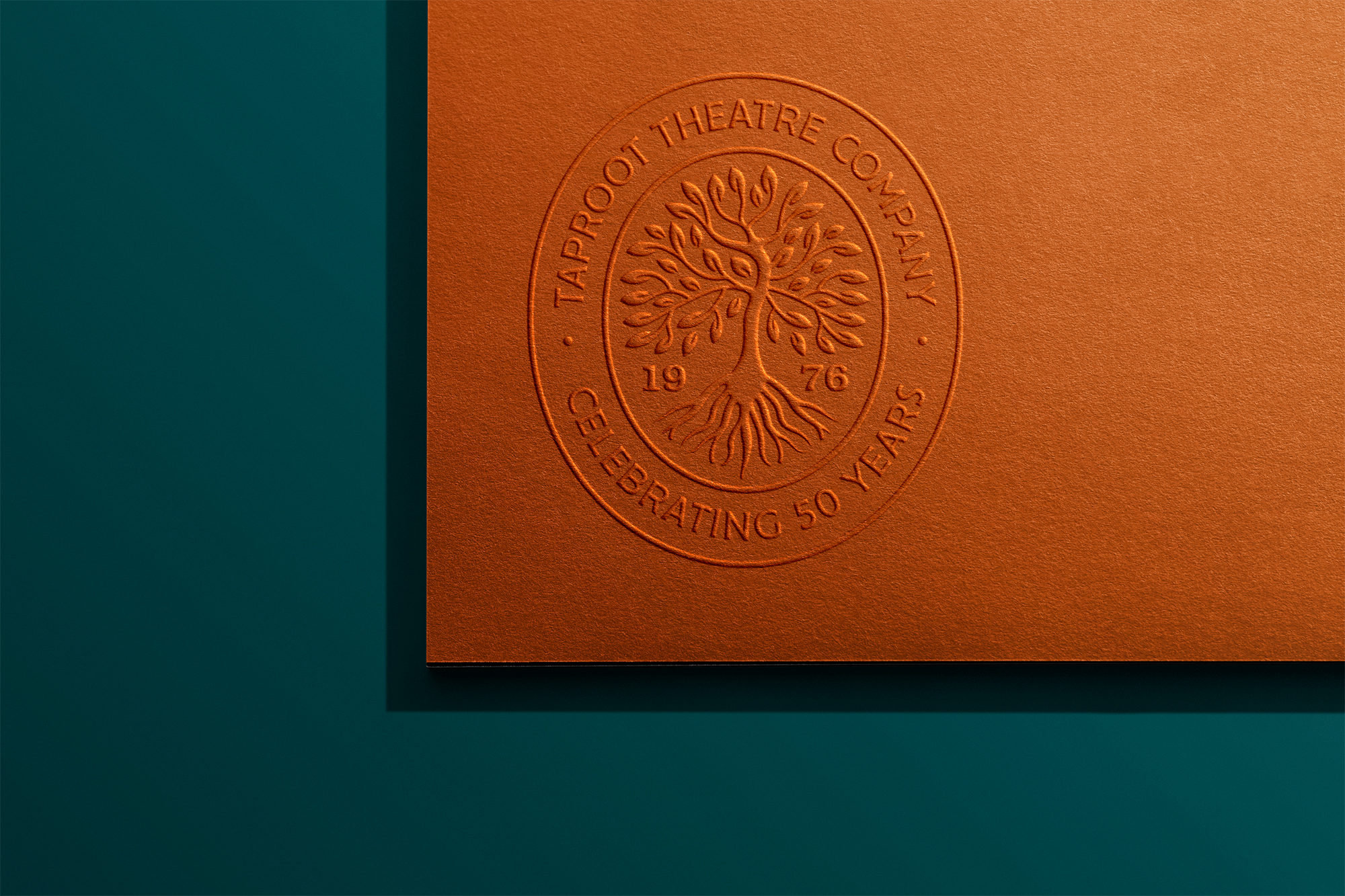
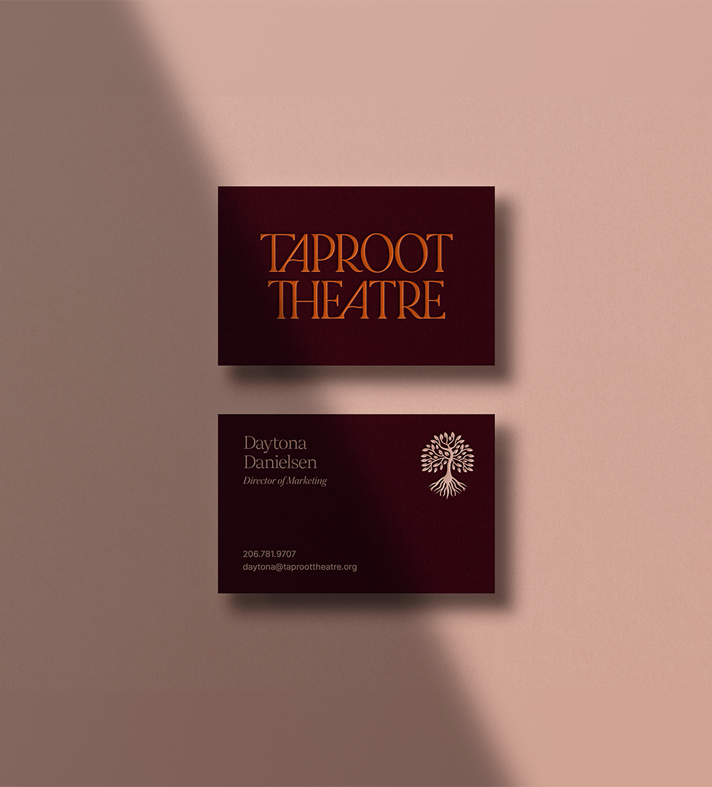
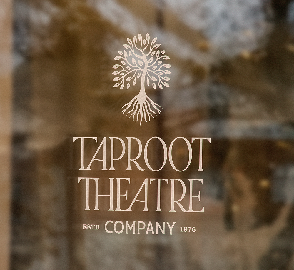
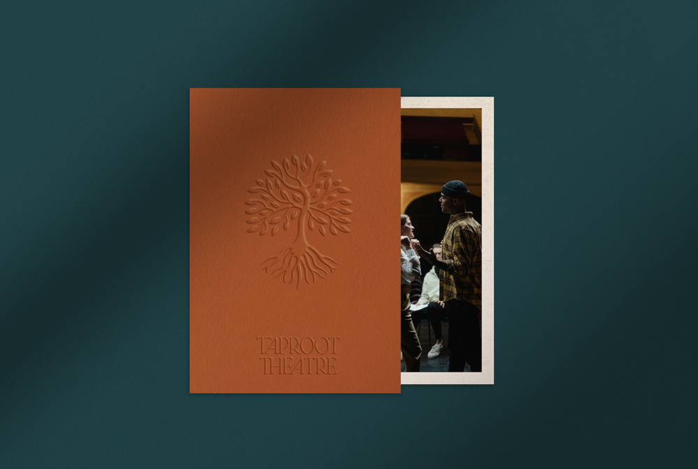
To usher them into the next 50, People People designed an elegant new visual identity; featuring a wordmark, full of warmth and sophistication, a hand drawn tree icon, and a lush, memorable palette.
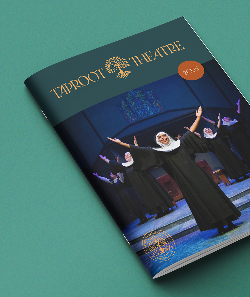
A rich legacy of storytelling deserves a rich palette. Deep, earthy hues and vibrant pops of teal and orange speak to the kind of performances Taproot Theatre promises: memorable, uplifting, and deeply rooted in the human experience.


The taproot symbolizes strength, stability, and nourishment. It’s a fitting metaphor for an organization grounded in something deeper, with a mission that continues to grow.
We paired expressive, fluid type set in an upright and theatrical serif with the softer, organic lines of the hand drawn tree. Together, type and icon convey strength of spirit and a legacy of storytelling that dives deep, while reaching out.