
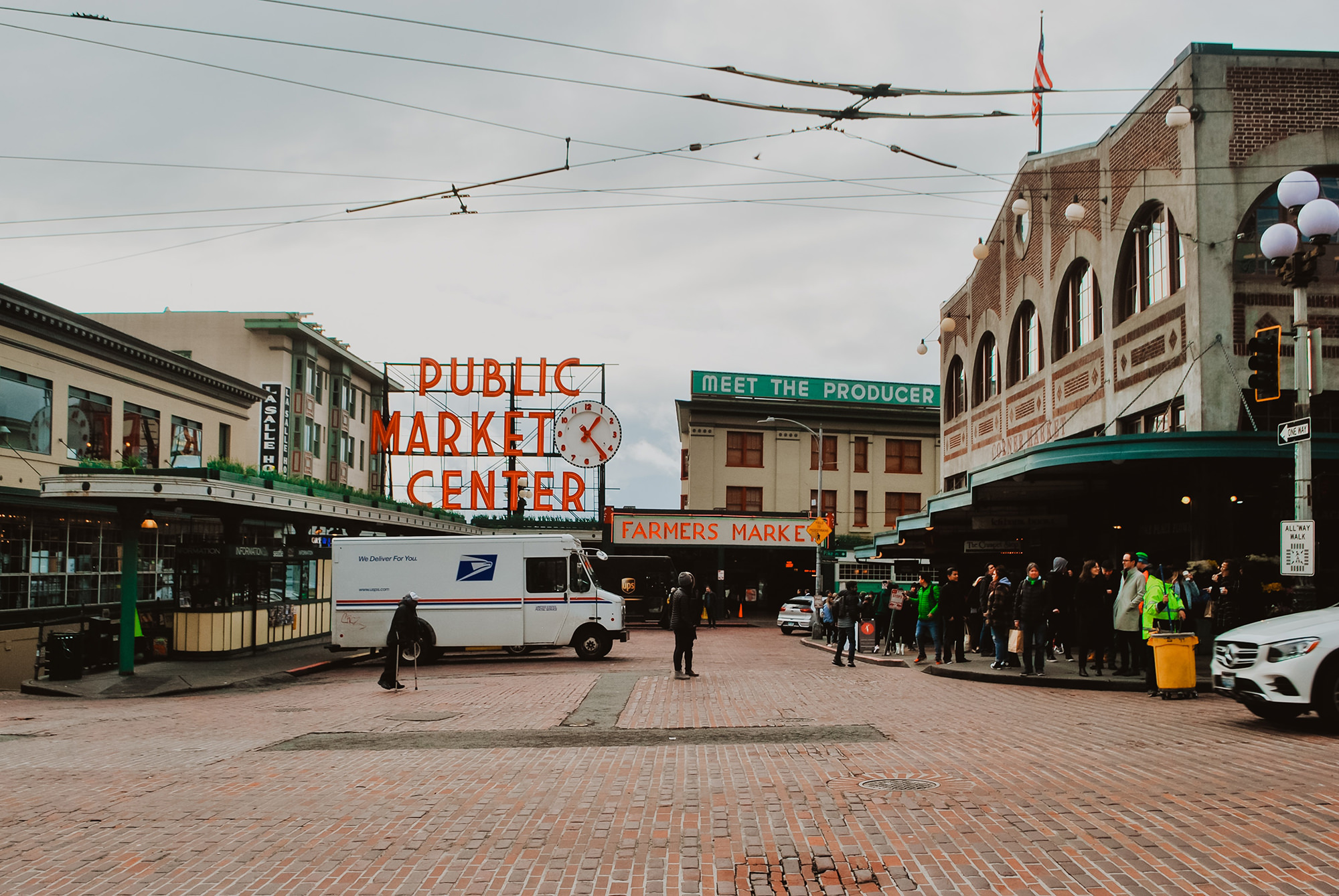
Pike Place is the heart of Seattle, and lucky for us we get to play an integral part in communicating what makes it special. Over the past few years we have had the opportunity to design a new logo for the Market, as well as produce several campaigns, visitors guides, and more.
A fire tore through Pike Place Market in 1974, leaving a chasm where part of the original Market once stood. Over four decades, development constraints and economic viability prevented a reclaiming of the site — a set of feasibility challenges that sadly prevented the modern realization of the Market’s original footprint.
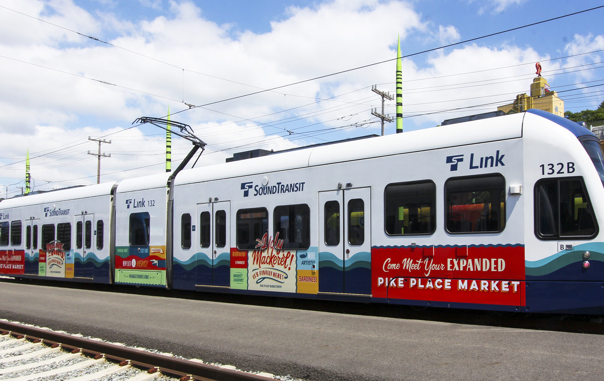
To say that forty years is suspenseful would be an understatement. And so when it finally became possible for the Market to design, build, and joyfully open its new wing, we could think of only one thing to say — HOLY MACKEREL! It’s finally here!
Retro hand-lettered signs and old-timey exclamations provided the inspiration for a city-wide marketing campaign announcing the MarketFront’s public grand opening.

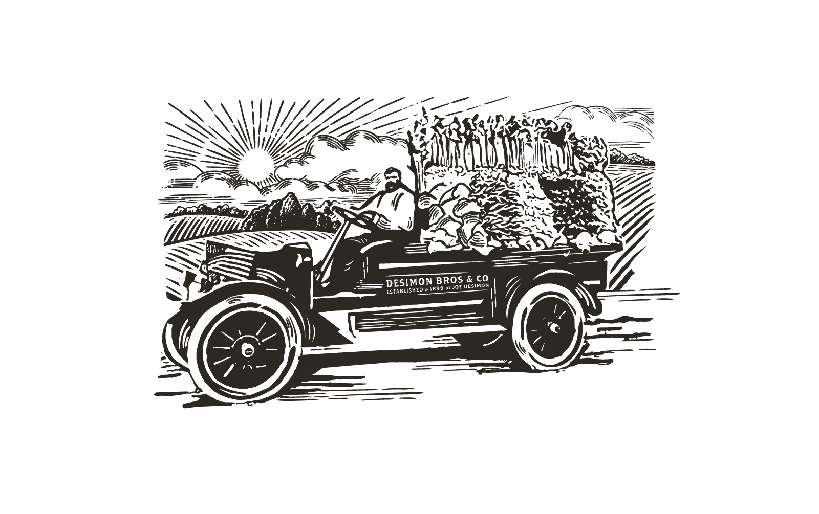
Did you know that Pike Place has a CSA program? We designed a CSA delivery box to remind Seattle locals of the Market’s 100+ year history bringing fresh produce and artisanal products from WA State farms to the heart of Seattle.

In an era of one-click orders and next-day deliveries, Pike Place Market engaged People People to conceptualize a holiday-themed marketing campaign to remind Seattleites about what makes the Market the quintessential holiday shopping experience. Say goodbye to generic gifts. Say hello to Pike Place Market’s “Offline” Gift Guide.

An interactive, illustrated Market-scape allows shoppers to browse unique gifts by category — from Hand Crafted to Farm Fresh — and create a custom shopping list and treasure map for navigating the byzantine labyrinth that is Pike Place Market.