Background
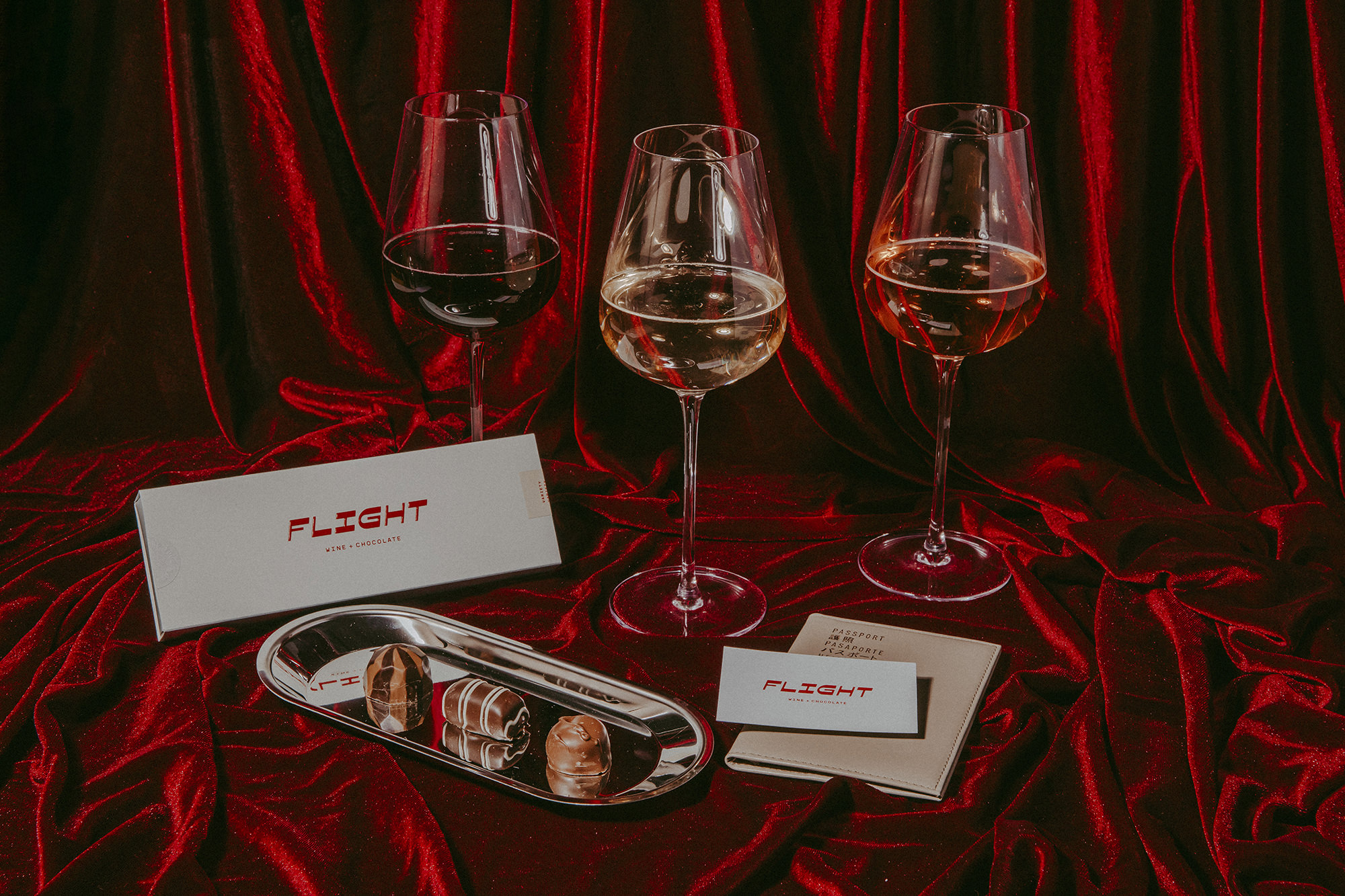
No travel agents. No trip to Woodinville. But always an escape to somewhere new.
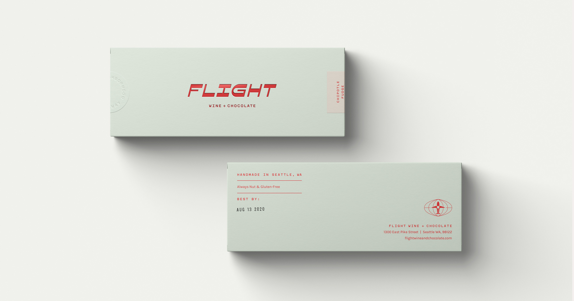
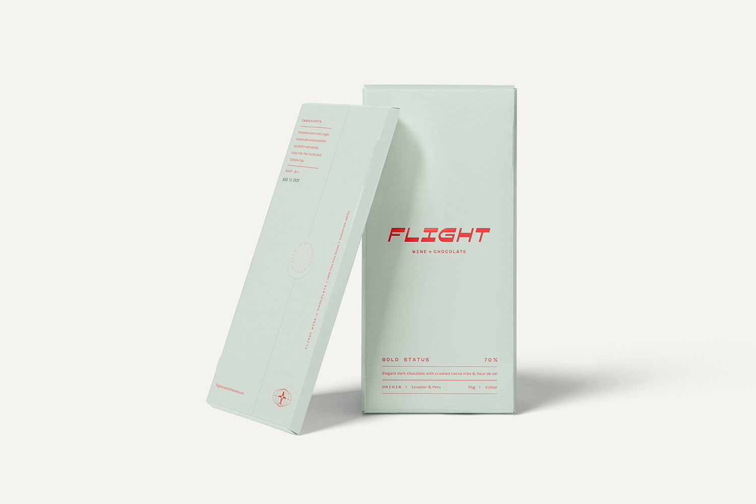
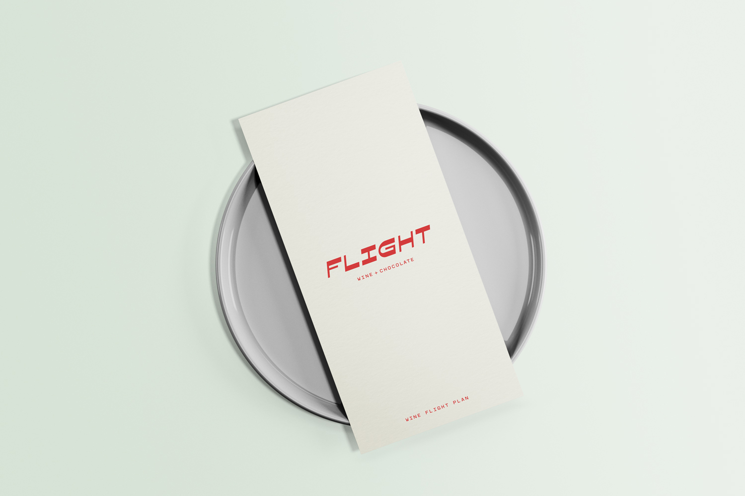
Flight Wine + Chocolate offers a chance to explore the best of Washington’s vineyards — all without leaving Seattle. With wine and house-made chocolate served in — you guessed it — flights, it’s easy to be transported by taste alone.
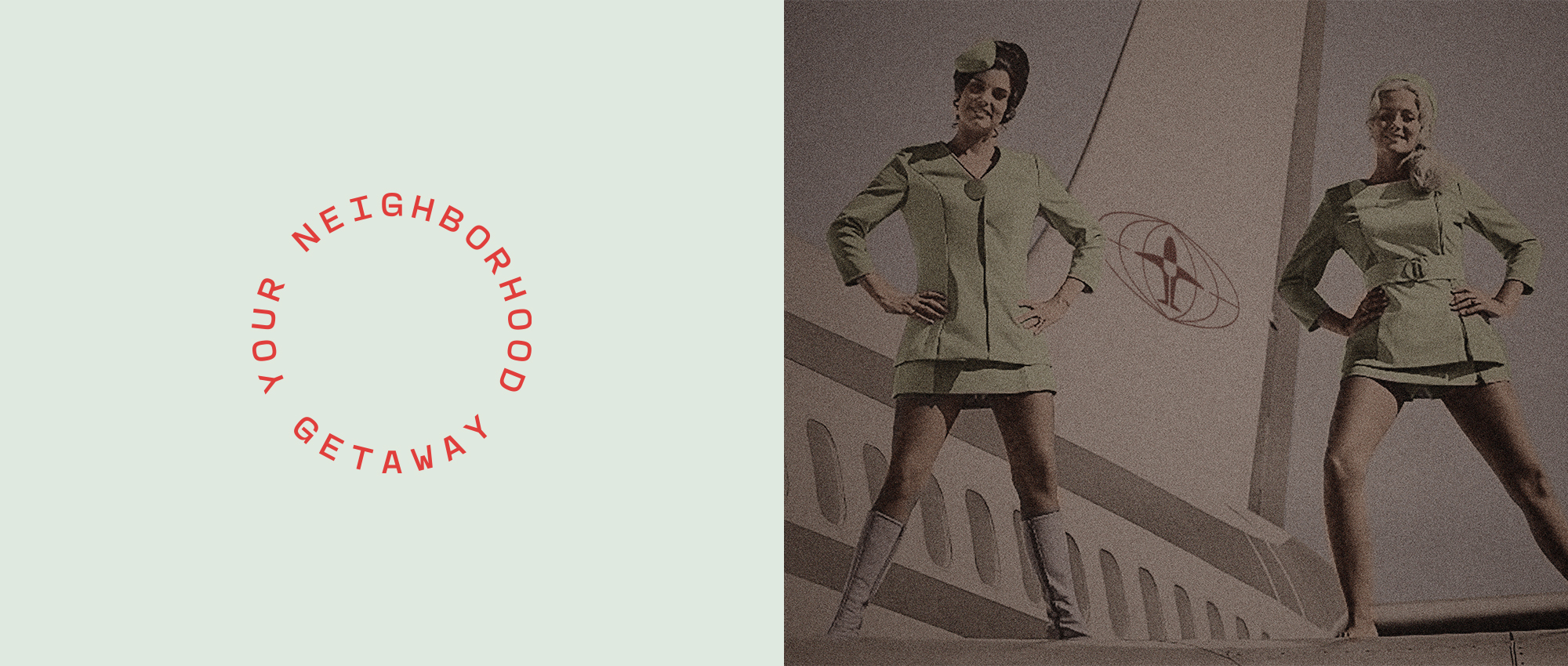
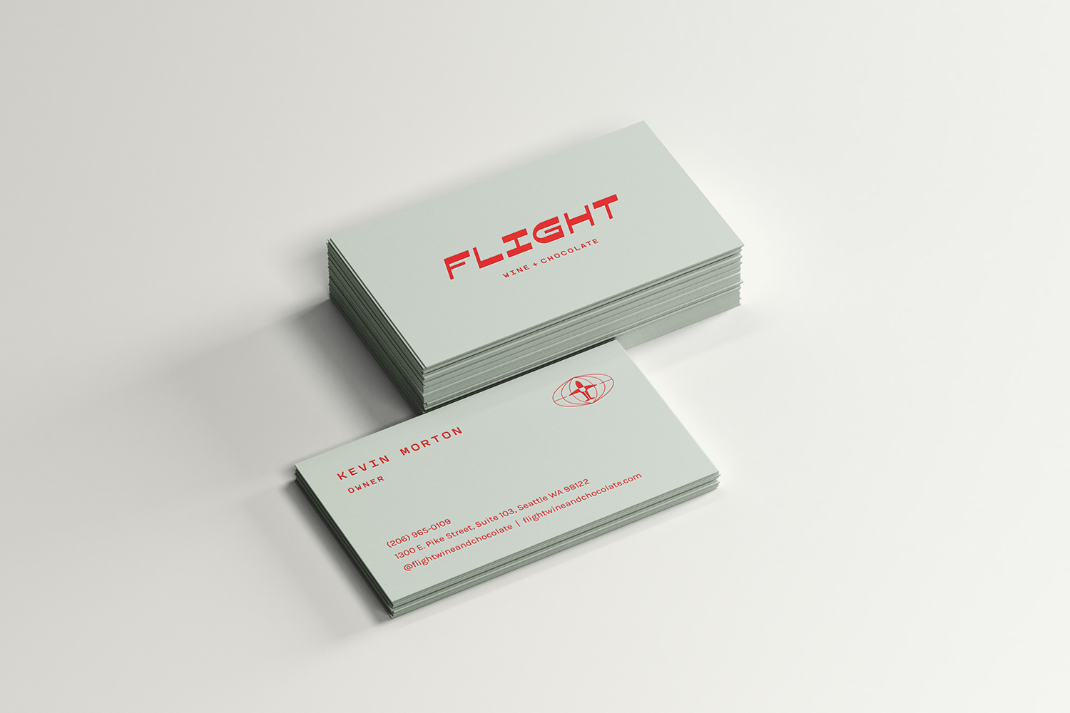
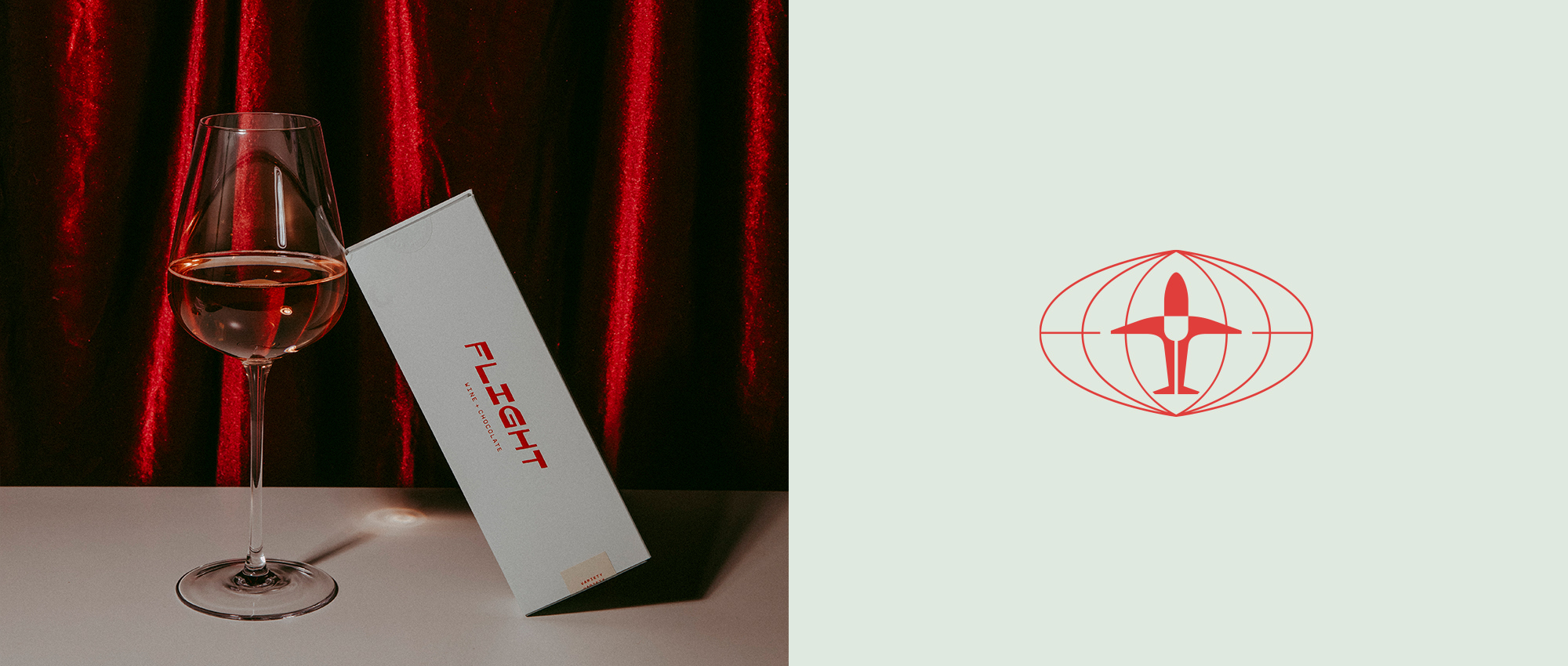
We helped the Flight crew first with brand strategy + messaging, an early step which paid quick dividends when it came to their visual branding. Aviation chic is a broad category, and our collective understanding of which references would fly — and which would better be left on the tarmac — helped us to quickly define a visual style that embraced vintage aviation cheekily, while retaining a distinctly-fresh edge that elevated the brand beyond homage.