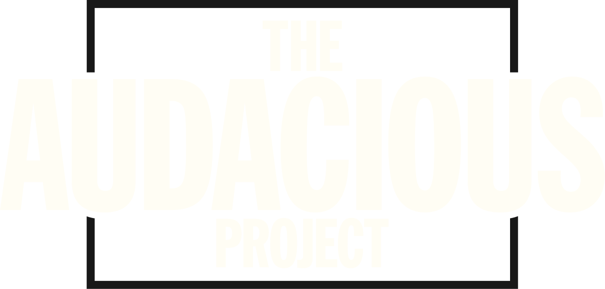
The Audacious Project brings together bold ideas and catalytic funding to take on some of the world’s most urgent challenges. Housed at TED, the collaborative initiative helps visionary changemakers turn ambitious ideas into actionable plans, connecting them with a global community of philanthropists and supporters.
We partnered with Audacious to evolve their visual identity into a more expansive, flexible system, building on the strength of the existing brand while giving their team more ways to bring it to life. The refresh introduced an expanded color palette and typography, a new suite of graphic elements, and an updated visual language designed to work seamlessly across print, digital, social and environmental applications.
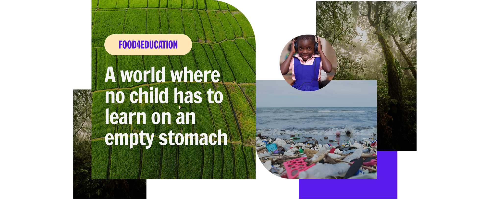

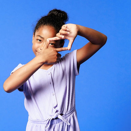
We developed a flexible system of bold geometric shapes, mixing curves and sharp edges create a sense of energy, growth, and interaction. Designed to expand, overlap, and stack in endless combinations, the shapes can transform from image frames and patterns to textural backgrounds and data visualizations, giving the brand a recognizable thread without relying on a rigid formula.
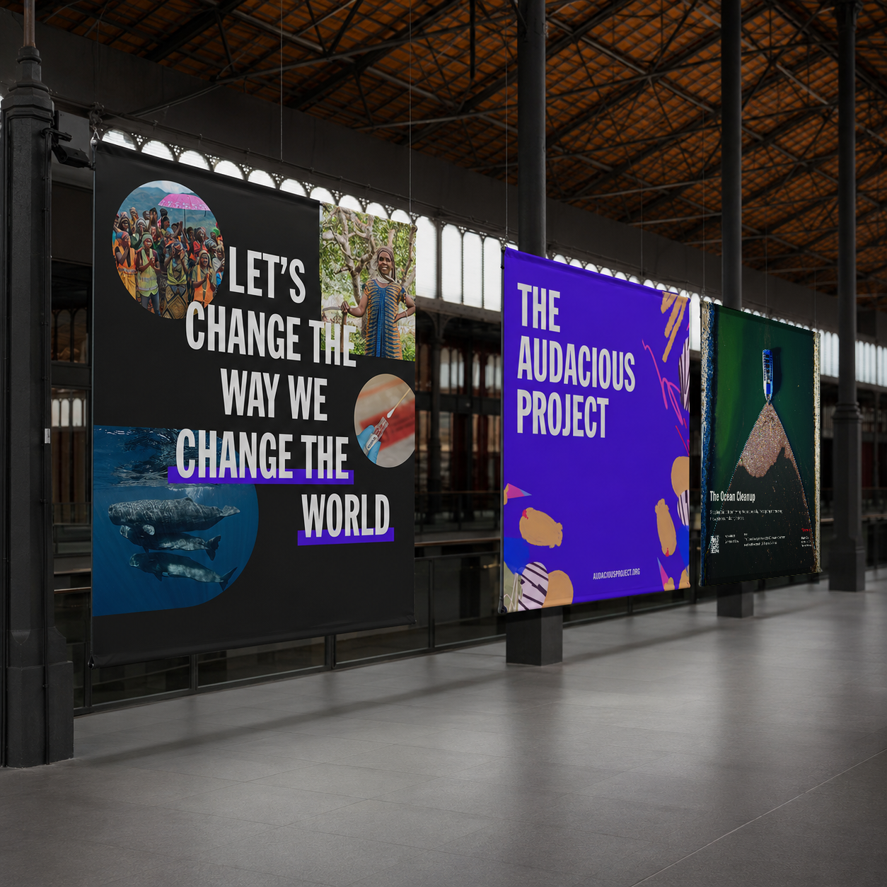
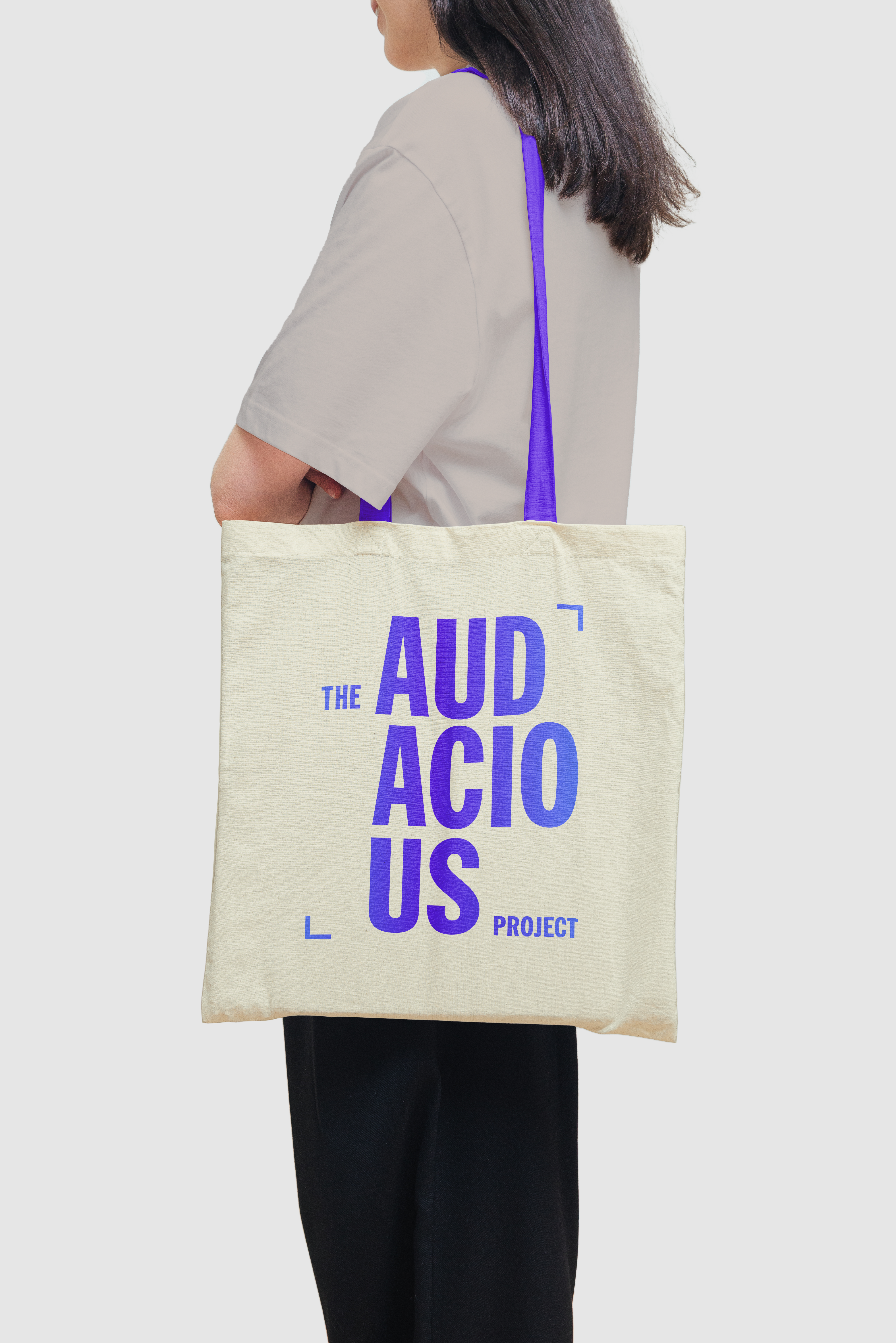
Building on Audacious’s signature purple and black, we introduced soft peach and cream tones to create balance and broaden the palette. The warmer neutrals give the vibrant purple room to breathe while opening up new combinations that feel equally at home in eye-catching campaign moments and quieter, more editorial applications.
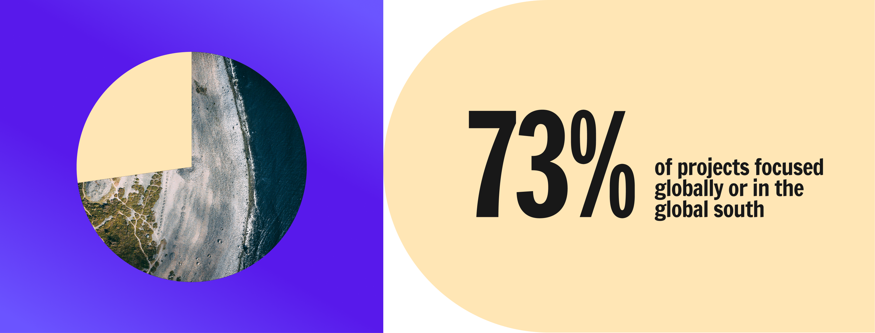
The refreshed system moves easily from big-picture storytelling to everyday communications. We extended the new visual language across social media and presentation templates, creating adaptable tools that allow the Audacious team to communicate a wide range of stories, ideas, and impact while maintaining a cohesive point of view.
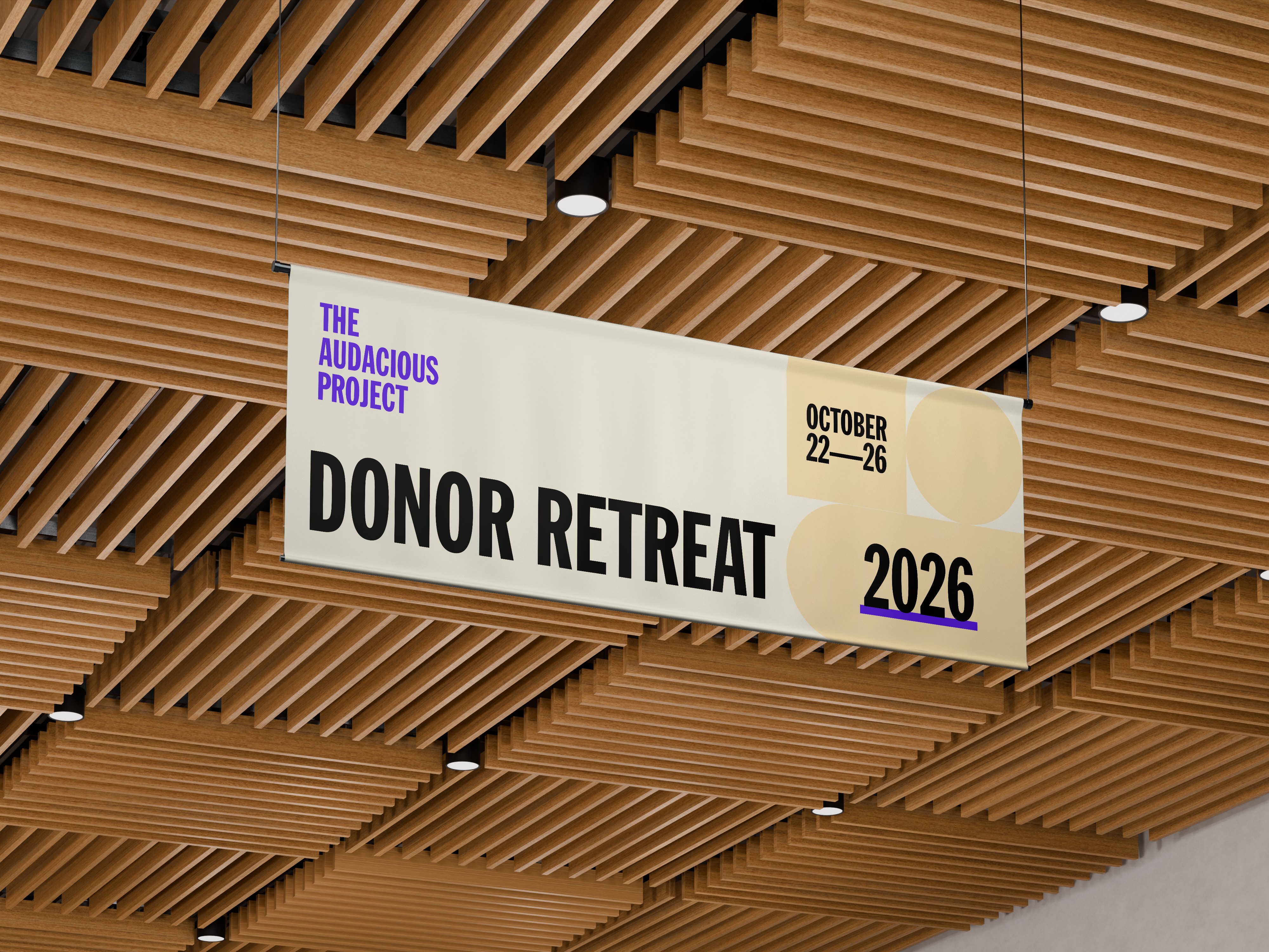
The system also came to life across printed and environmental materials for Audacious retreats, from event signage and presentation graphics to takeaways and custom collateral. Across every touchpoint, the flexible toolkit creates continuity while leaving room for each application to feel distinct, helping the brand stay recognizable without becoming repetitive.