Background
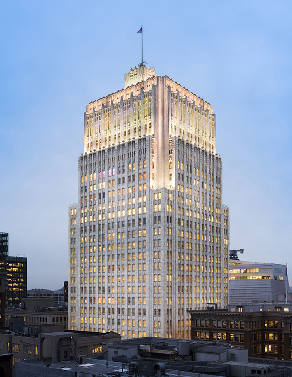
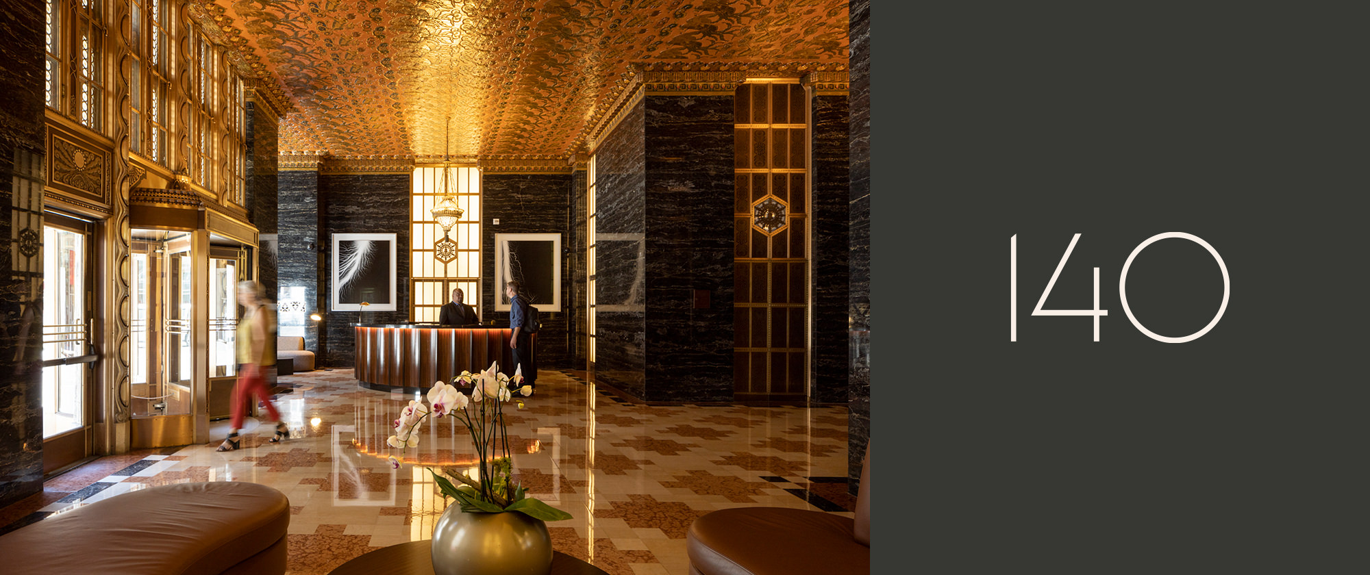
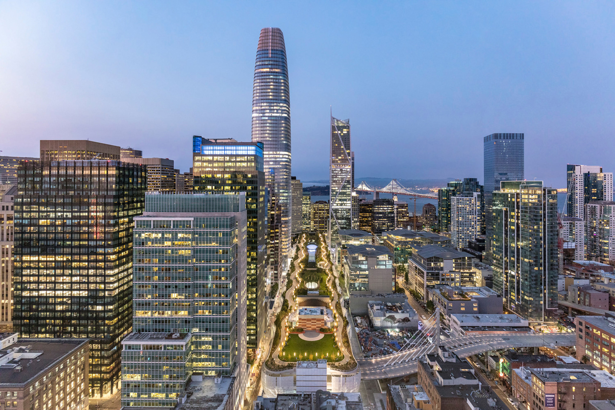
The 140 New Montgomery building has shaped San Francisco for generations. Enlisted to help with reimagining the strategy, messaging and visual brand, we bridged the building’s historical roots with its modern offerings as a commercial office space. After striking a balance of dynamic verbiage and a timeless graphic system, we tackled the website design and development, which served as a vehicle to further expand upon the story and visual language. The overall result is a seamless connection of past and present.


