
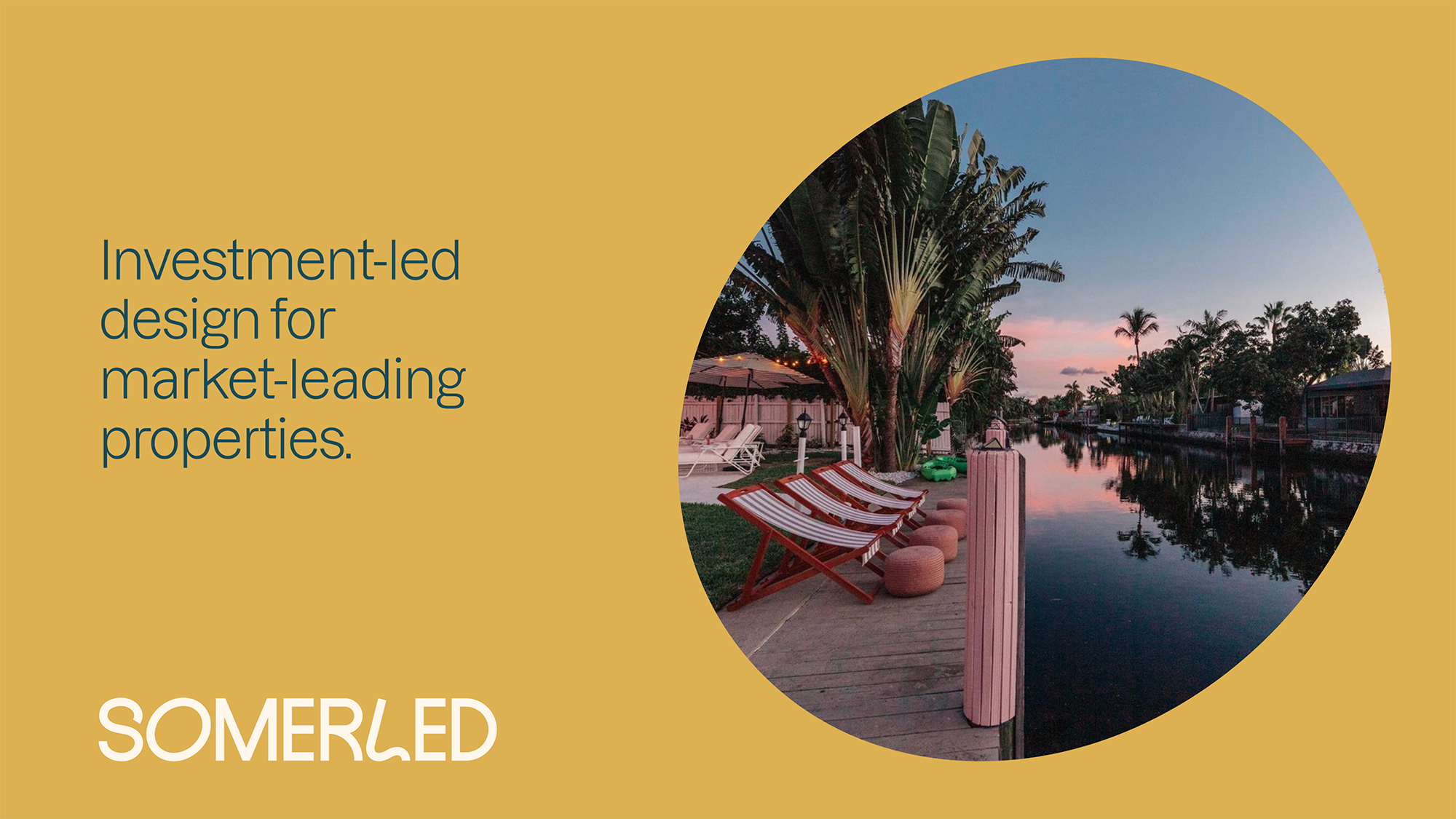
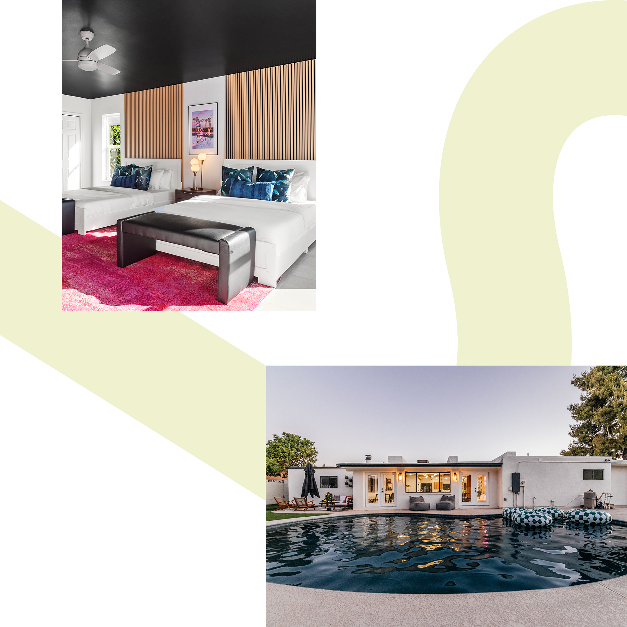
Somerled designs high-performing short-term rental properties by creating unforgettable spaces that foster meaningful experiences. Blending in-depth market research with an industry-leading investment strategy, their mission is to craft spaces that are not only beautiful and functional, but thoughtfully elevated.
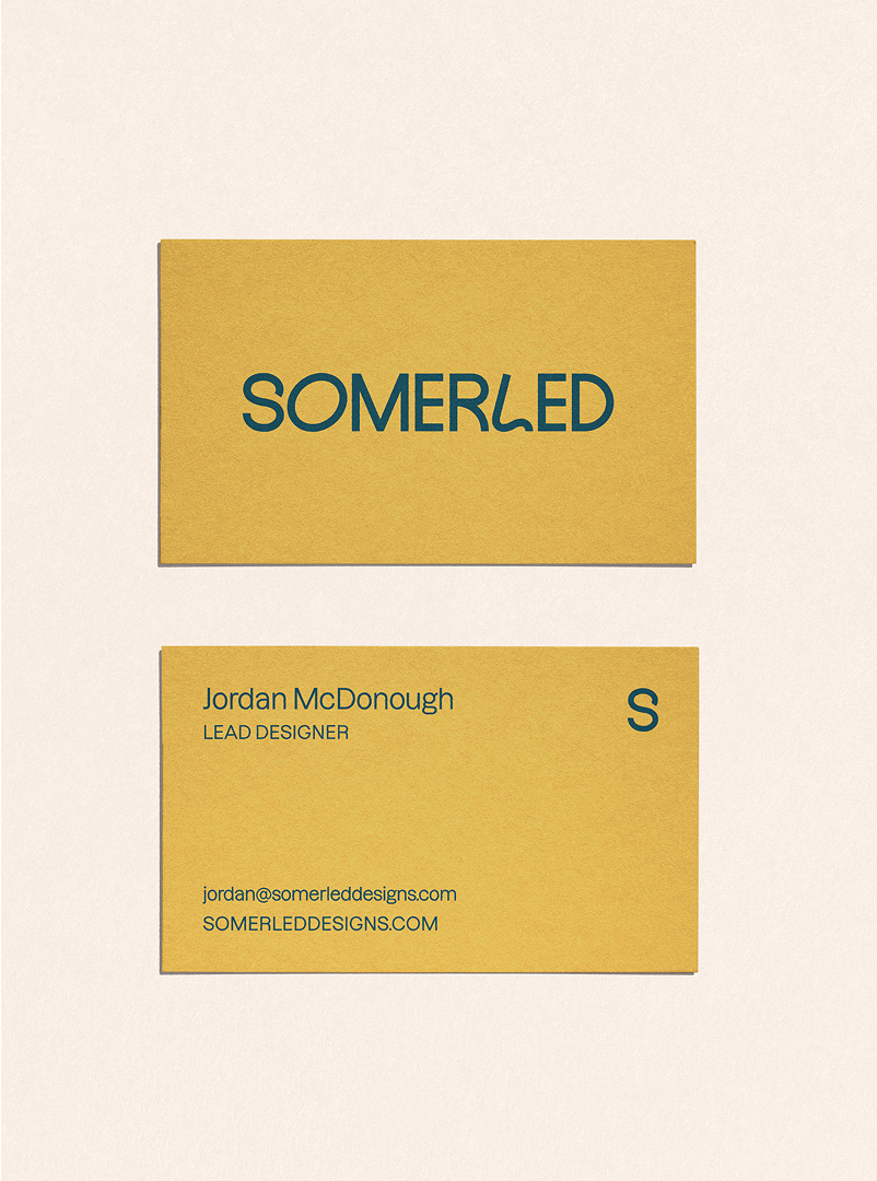
They partnered with us to refine their brand strategy and messaging, and to lead a visual rebrand. Following an in-depth discovery phase, we clarified their positioning and set the foundation for design. We started by creating a custom wordmark—a logo that’s both highly legible and playfully distinctive, offering a timeless, fluid expression of their strategic and creative strengths.
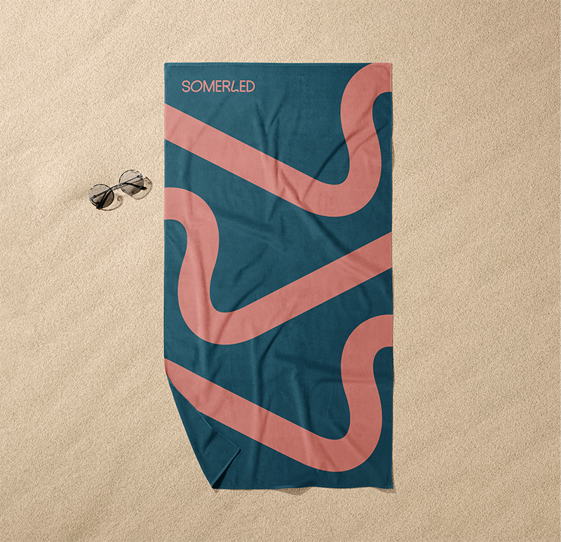
Unique letterforms within the logo create a system of additional graphic elements: the ‘S’ as a memorable secondary icon, the ‘O’ becoming a container for imagery or as copy space, and the ‘L’ as a background detail or repeating pattern.

The identity is grounded in a color palette inspired by the feeling of a great getaway: sun-warmed hues and earthy tones drawn from the landscapes and luxe amenities found in their stylish properties.
A custom icon set depicts Somerled’s core pillars in an abstract, geometric style – speaking to their creative approach and complementing the forms in their logotype.